

In the first part of this series, I covered key paired components of a classical safety case; development and validation, process and product. But modern inventions, new companies, and big ambitions are changing safety cases drastically. In this article we will cover how metrics have transitioned from the role of evidence to the role of full-blown safety case.
From data as a support to data as a risk marker
When your perception and decision making systems become increasingly complex and perhaps imbued with machine learning, demonstrating that your robot design is safe enough becomes more difficult. This has likely driven companies that were already collecting performance data to look more seriously at using that same data for safety assurance. I suspect that this then further liberates system development from the perceived burden of good design rigor, leading to ideas like “as long as the data shows we are safe, we don’t have to worry about classical safety design processes and requirements”. This is not entirely true of course, as safe system development is intended to protect against a set of dangers that are by nature very rare and very severe. Regardless, this data then starts to lead a life of its own. What starts as an attempt to clarify test results or to visualize a deployment issue tracker can end up filling a new and precarious role as deployment barrier. This is worrisome because the way we have set up a tracker or a test result dashboard is not complete and not correct enough to fill this important role, but that does not seem to stop this from happening to projects and companies everywhere. The data is flawed, and the dashboards are too.
Where does the data come from?
Most robot companies collect large amounts of data from their testing and deployment missions and sort through that to gain certain insights into performance and safety. It is likely that this large amount of data gets stored in a repository and from that data queries are made to collect these desired insights. An engineer will write queries to count instances, missions or miles where a something specific happened. They could likely pull up detailed acceleration data over a whenever it reached over a certain value, or count the amount of times a door was opened on average during a mission, or show the number of detected objects at any point in the mission. All of these queries then can get added into tables and presented in graphs, and sometimes its surrounding event data is recorded for review. Whether data is live reported from the robot or sorted through after is not important in this discussion. What you think you can do with this data (and what you cannot do with it) is more important here.
What are we actually measuring?
What are your metrics really measuring? Are they leading or lagging indicators, and of what? Are they indicative at all for what you intend to measure? There are many things to measure but it is truly difficult to relate measurements and counts to actual system safety. I will go into the why’s and how’s here in a more detail, and if this is too technical please feel free to skip this section.
Counting instances for something like ‘an almost collision with another road user’ is a straightforward ask from a safety perspective, but is complicated to measure with the data as it is stored. How would we go about it? You could start with ‘count the number of times that a road user was within 30 cm of the outside of the robot’, but that assumes that the robot knows where its own outer edge is, and that there are no blind spots in its perception within that low distance to the robot. To solve this, we may need to create a routine calibration process to ensure we do not miss instances due to software and hardware issues stemming from installation and maintenance. We also have to provide reasoning for the 30cm threshold. Then, we should exclude loading and unloading of the robot from the ‘road user is nearby the robot’ instances, so we must know when loading and unloading happens during the mission. Then, we have to determine what the boundaries of our original request are. Would we care about an almost collision when we are stationary and another road user comes close to us while we are stationary? Maybe we should exclude all incidents that do not include a braking event within 5 seconds before the close proximity? Or should it be 30 seconds? And why that time frame? We would include or exclude scenarios depending on the reasoning for this time duration, so the duration is important.
These last questions really highlight a challenge in our data-as-a-safety-case quest: how much noise is in the data that we are presenting and how can we tell what is noise and what is not? Noise in the dashboards can come from the operating environment, the design specification, the robot systems, and the data itself.
An imperfect but popular solution to solving some of the uncertainties of whether a scenario qualifies for our criteria or not is to require a human specialist review of a subset of scenarios to ensure that it is valid. This comes with its own difficulties as human reviews come with uncertainty and scale poorly to larger sets of data. Questions about how human reviewers maintain consistency across reviews and where the human reviewer training data is managed will have to be answered too.
If all of this is in place in an attempt to answer the original query, would you be confident we have accurately counted all ‘almost collisions with another road user’, or are there other use cases that have not been considered? Will there be false positives within the current data set? I’d guess that the answer for both of these questions is yes.
Safety goals and requirements are difficult to put into automated metrics and the data that is available to use is not suitable to put safety or performance labels on.
From this thought exercise we have learned that translating a straight-forward safety ask into a data query is difficult. What about concluding safety issues from the data itself? That is also a challenge. You can often only measure what you have already seen before. For example, passenger comfort can be increasingly difficult to objectify and to measure unless it has been seen, experienced, and measured before. If I asked an engineer to ensure oscillation in the planner that affects rider comfort is captured in the metrics, it would likely not effectively be picked up without specific example data. Knowing this, how many other system and performance issues are uncaptured because we have not encountered them before? This question, classically, is what a good safety/ quality/ system analysis will answer for you: it gives you a list of risks that are possible or probable but have not yet been encountered.
We have come full circle then: Safety goals and requirements are difficult to put into automated metrics and the data that is available to use is not suitable to put safety or performance labels on.
What are we presenting?
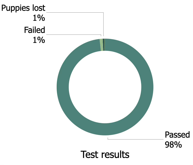
The way data is presented greatly affects how decisions are made. When you are presenting a dashboard of passed tests, the focus should not be on the green colored 98% pass rate; it should be on the red 2% failed tests. If we presented this as a pie chart or as a loading bar, the 2% would be greatly out shadowed by the 98% and the reader would get a false sense of safety. The real challenge is presenting the 2% with clarity and enough detail for people to understand why they are important, and where that failure will affect the project and its risks.
One way to present this data is to focus on much smaller categories that show better granularity of the failure cases. Perhaps half of the three way stop intersections failed, or a quarter of jaywalking scenarios. Another idea is to place the visualizations in reports after tables summarizing the issues or biggest risks, with the intention to provide an overview after having brought up the safety concerns first.
It is important to note that even with the best care and attention to the data and the presentation, dashboards built on robot data are likely much less robust than safety engineers would like. For safety cases and its various serious artifacts, there is a certain level of rigor and process around validation work. Is that the case here too? Are the underlying robot data, the measurement creation and management, the scenario review and the data presentation all subject to processes for rigor and change management? In general, all these aspects to data creation, collection, and presentation are unlikely to meet any type of safety process standard, and any outcome of this work should be treated with care within a safety case or safety argument.
What should we measure instead?
Where can metrics be useful? Some parts of your system safety design likely rely on specifics such as value thresholds or timing constraints and those lend themselves well to be measured and reported upon. Flags for operational envelope violations, novel scenarios, unexpected objects all make an excellent case for being included in a dashboard.
With care, test results could be included in a dashboard, or progress on a certain objective or milestone. If you do include counts of safety-adjacent instances, try to argue for an inclusion of caveats on the dashboard itself to ensure the reader has an understanding of the uncertainties of the data before making safety critical decisions.